Fintech
•
Concept
•
Fintech • Concept •
BJAK
Brief
BJAK, Malaysia’s #1 insurance platform, required a brand identity and market-entry strategy to disrupt the heavily saturated UK car insurance space.
Moving away from traditional market tropes and legacy branding, the objective was to position the new digital platform as a premium, frictionless alternative to standard aggregators. The benchmark was to mirror the clean, world-class operational sophistication of global fintech leaders.
Response
Established a distinctive "anti-faff" personality designed to shift the industry narrative from complex and bureaucratic to highly intuitive where we cut the shit and give the audience .
Creating a brand world fit for the UK including; TOV, colour palette, logo, typographic style, graphic language and motion personality. We stress tested the system logic across high-fidelity responsive web, social and OOH.
Result
The project delivered a bold and eye catching, quintisentially British launch campaign. By shifting the focus from static graphics to a systematic, modular Figma infrastructure, the creative direction proved that a high-volume comparison platform could achieve elite fintech positioning while remaining intensely practical for the everyday UK consumer.
Tone of voice
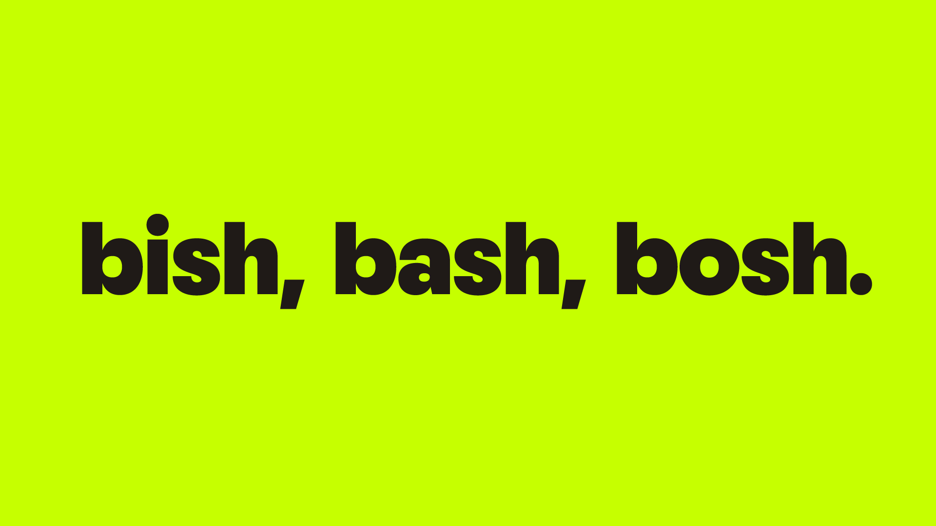
Hierarchy: Attention grabbing, direct and unapologetic headlines. Properly British and colloquial to appeal to our audience. Use alliteration to emphasise letter “B” for BJAK.
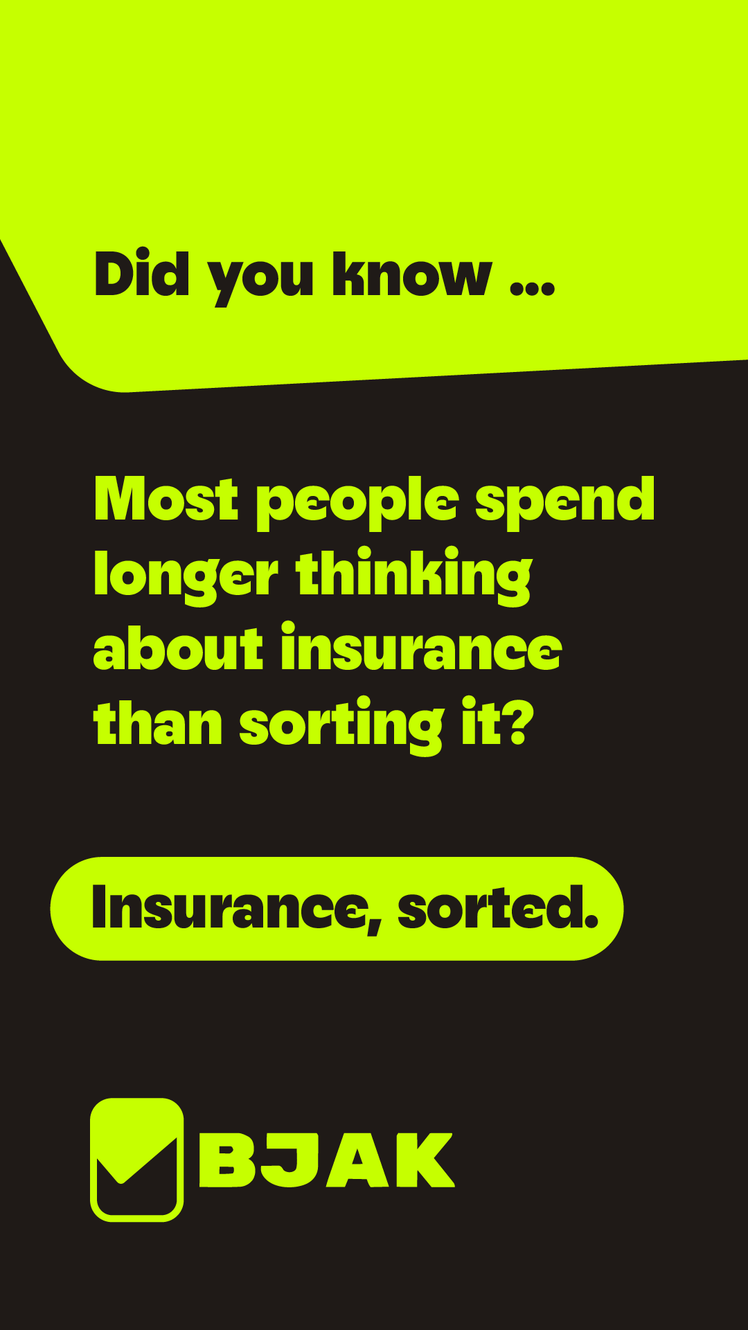
Accessibility: Highly legible body copy backgrounds for readability.
Font: Neighbor. Sans serif font packed with class and personality
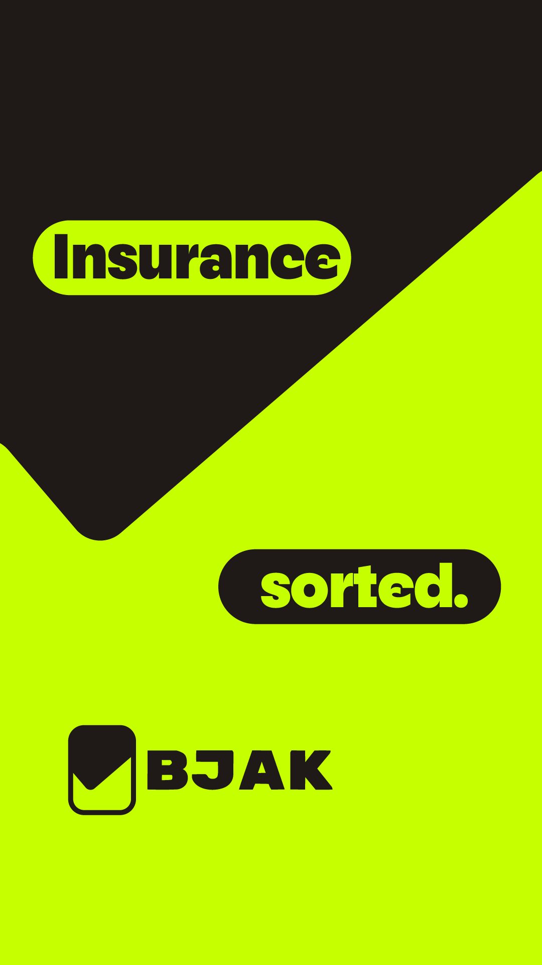
Logo system
We update the logo to reflect the efficeincy of using the BJAK platform. We get the job done. A tick / check mark reflects this.
We start with a simple tick
We use the tick’s angle as negative space
Finally we combine with the BJAK logotype

Graphic Language
We carve shapes through our compositions with the tick / check shape that forms our logo stamp.
The angle gives a dynamic feel to our layouts.
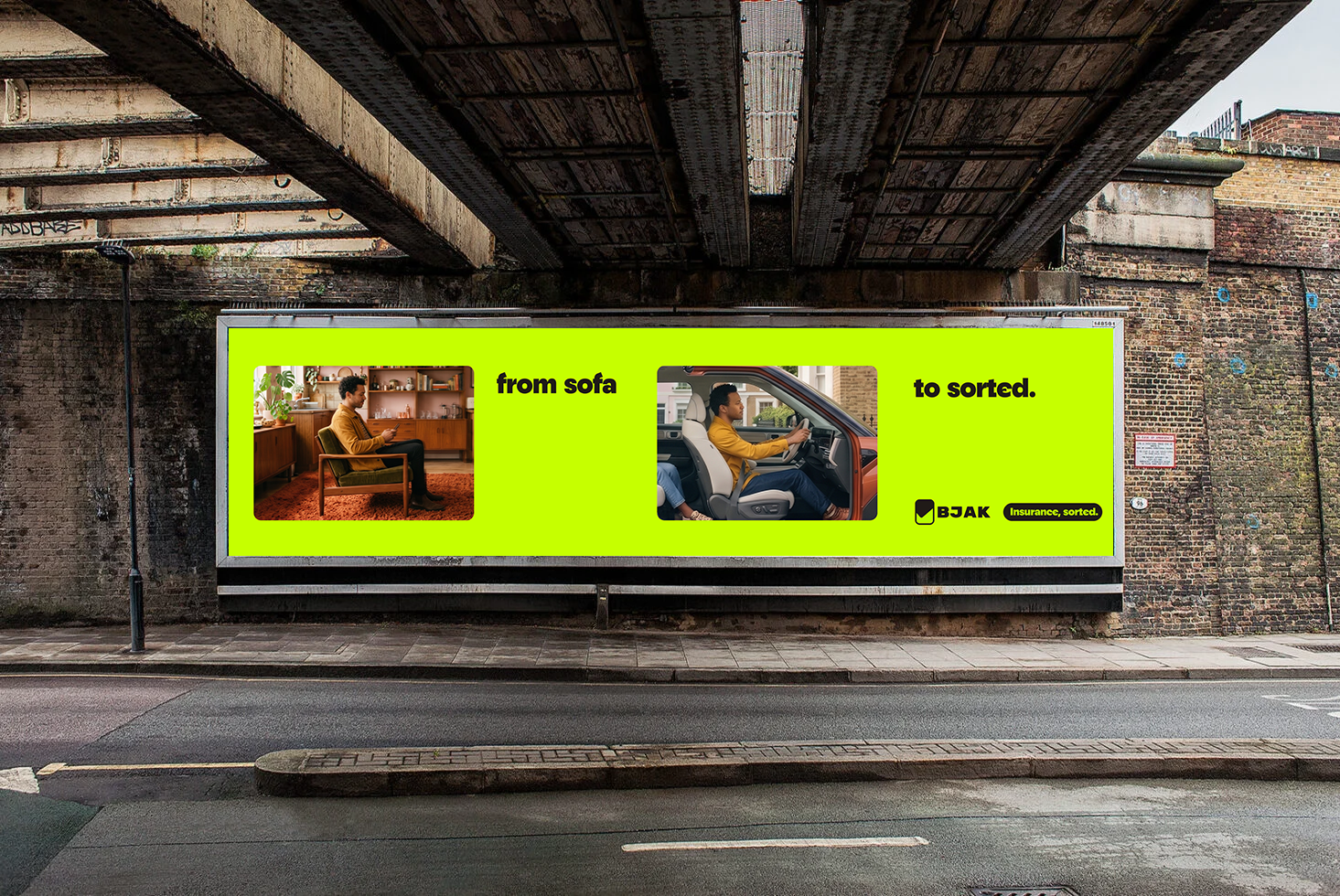
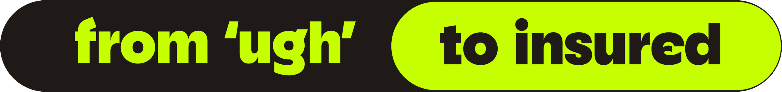
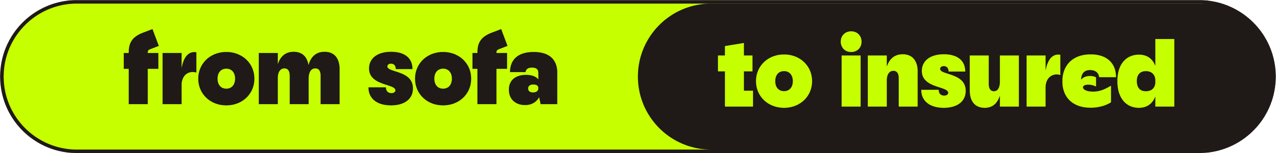
The Campaign Logic
The core idea behind 'From ___ to insured' is speed.
Traditional insurance comparison forces users through a dozen painful steps. Our AI platform skips the middle part completely, so our copywriting does the same.
By jumping straight from a relatable starting point directly to the finish line, we visually prove how fast and effortless BJAK is without having to over-explain the tech. It's a flexible formula that tells the UK driver exactly what they get: zero admin, instant results.
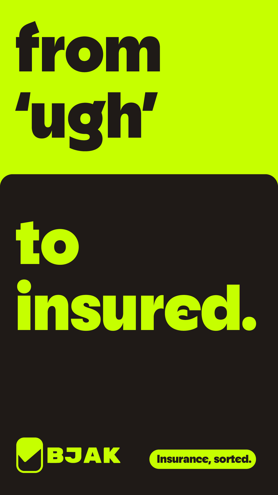
Motion Language
Our entire motion language is built around the satisfying, playful mechanics of "switches" and "nodes." We are taking the exhausting act of changing insurers and visually distilling it into a single, effortless UI interaction. The creative direction relies on fast, seamless match cuts driven by dramatic colour changes.
Motion Language
As the UI toggle slides from the problem ("from 'ugh'") to the solution ("to insured"), the environment instantly reacts. We match-cut on the swipe, snapping from our moody brown to lime. It’s snappy, slightly cheeky, and deeply satisfying, proving that with BJAK’s AI, switching your car insurance is literally as easy as flicking a switch.


G-SHOCK - Editorial
Moss - Fashion
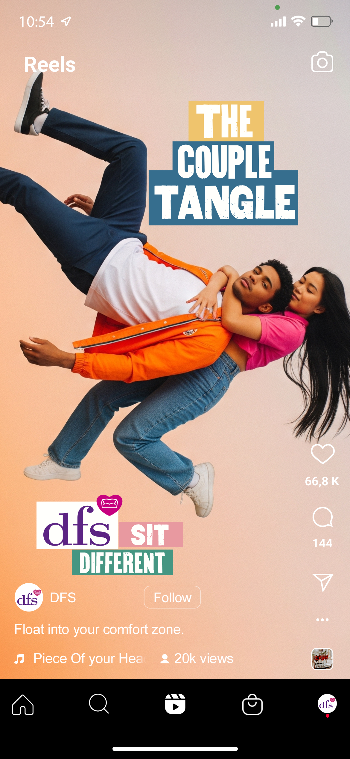
DFS - Social
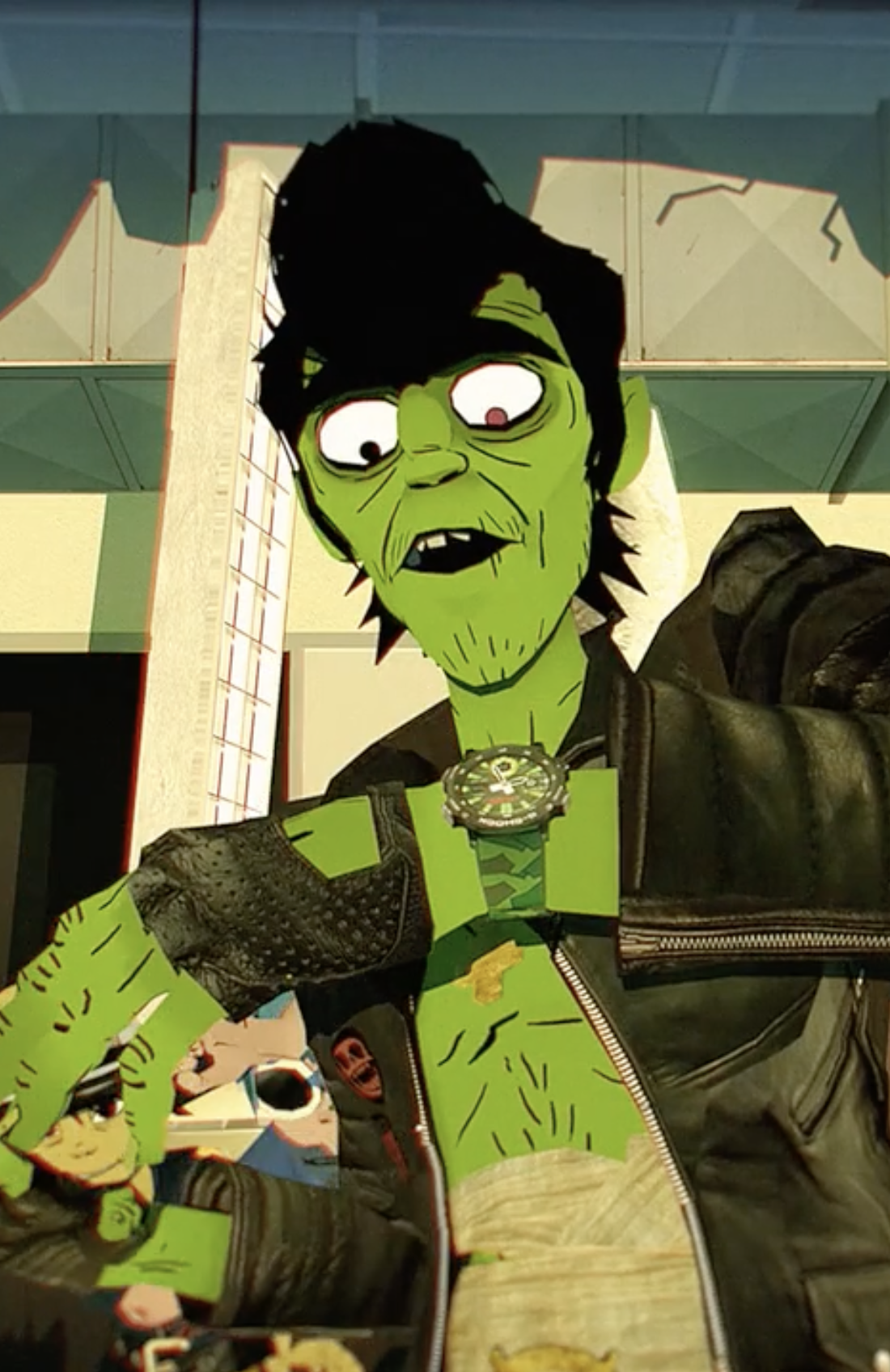
Gorillaz - Branding / Animation / Product
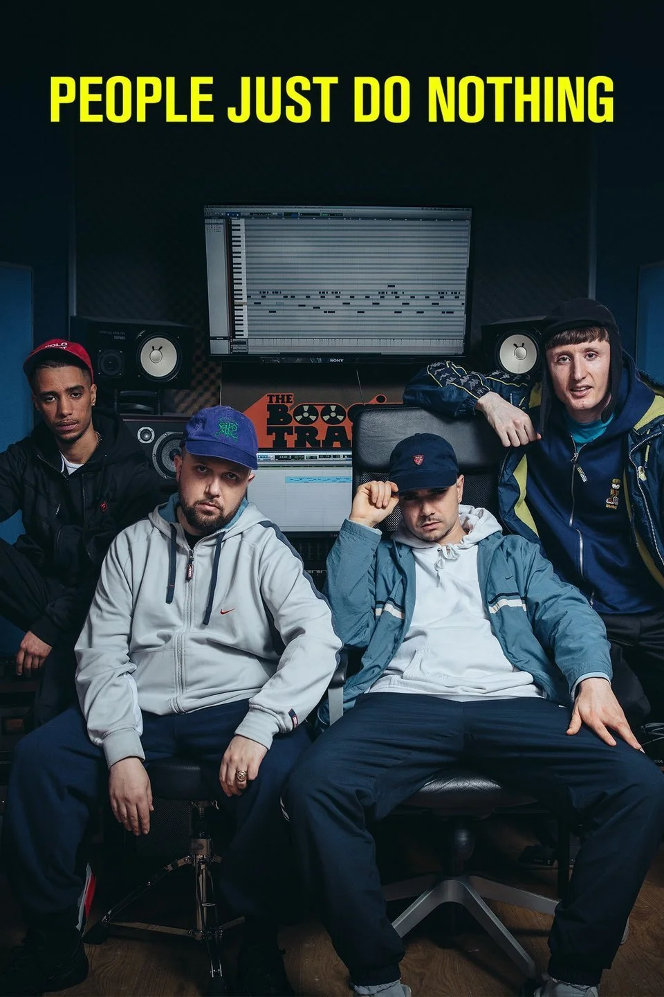
People Just Do Nothing - Music / TV
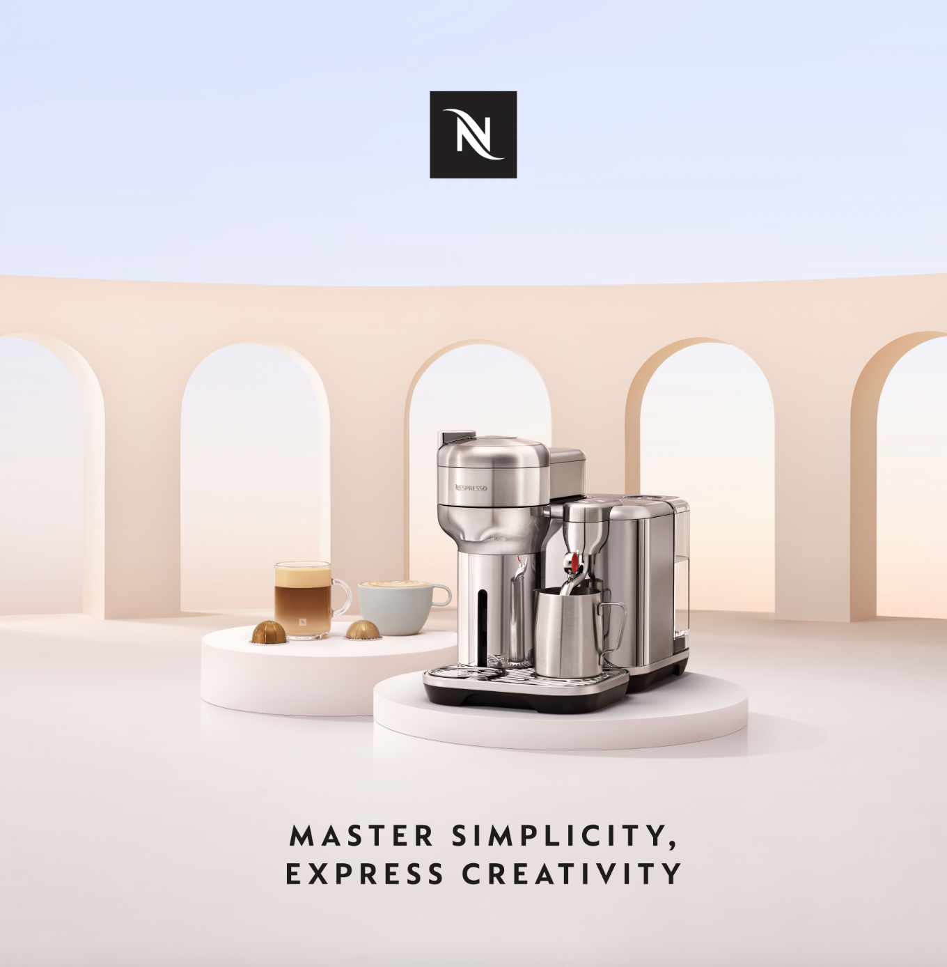
Nespresso - FMCG

Deliveroo - Performance
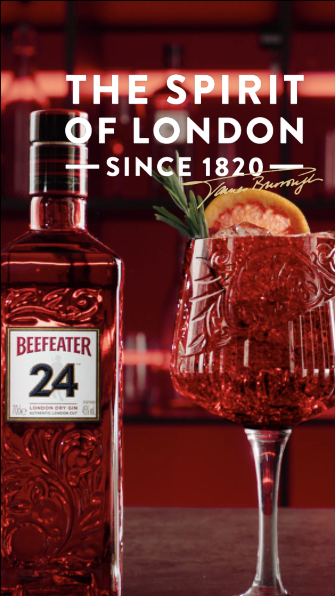
Beefeater - Alcohol
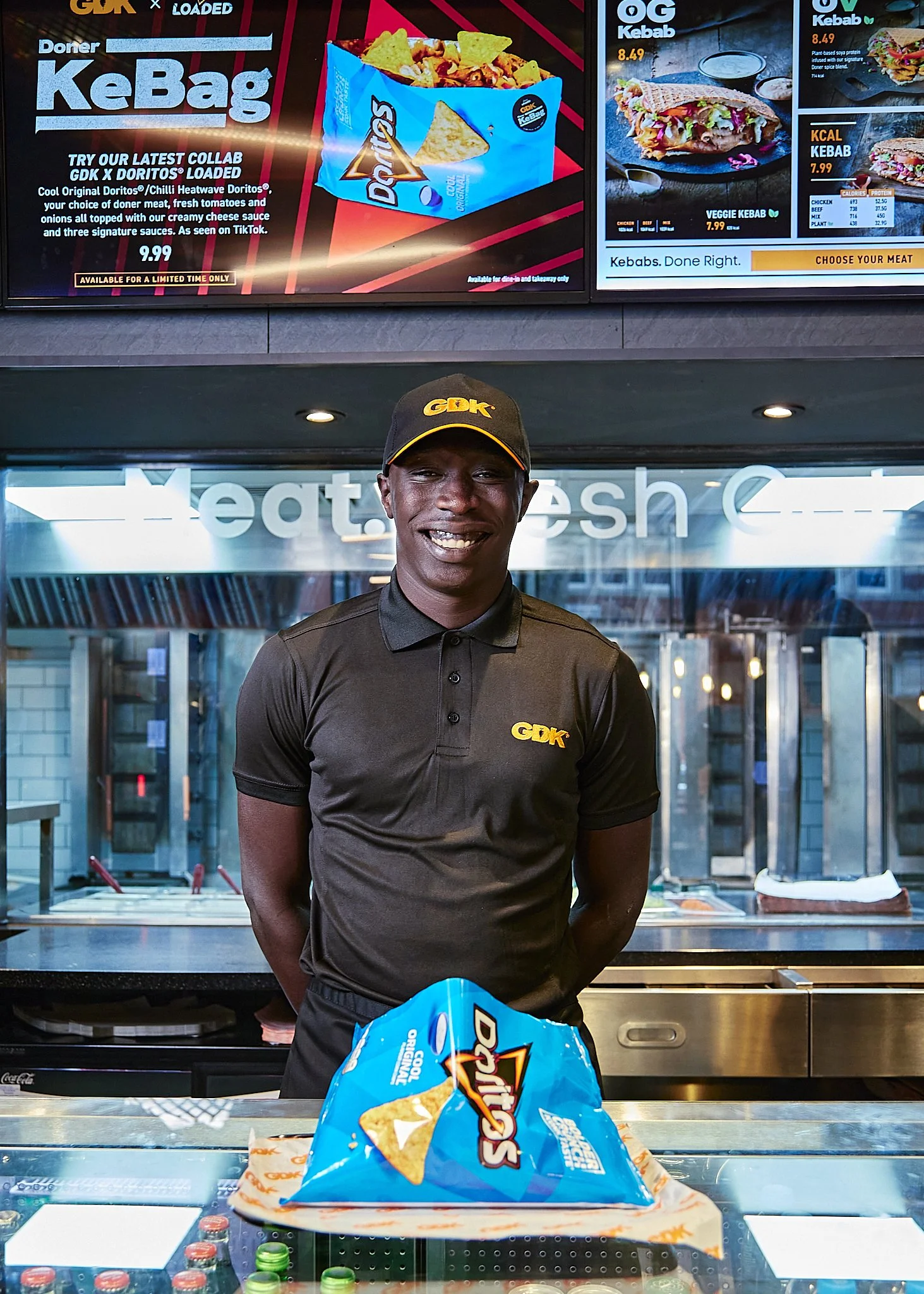
GDK - FMCG
Huel - Health

Kahlua - Alcohol
Goodsocial - Branding
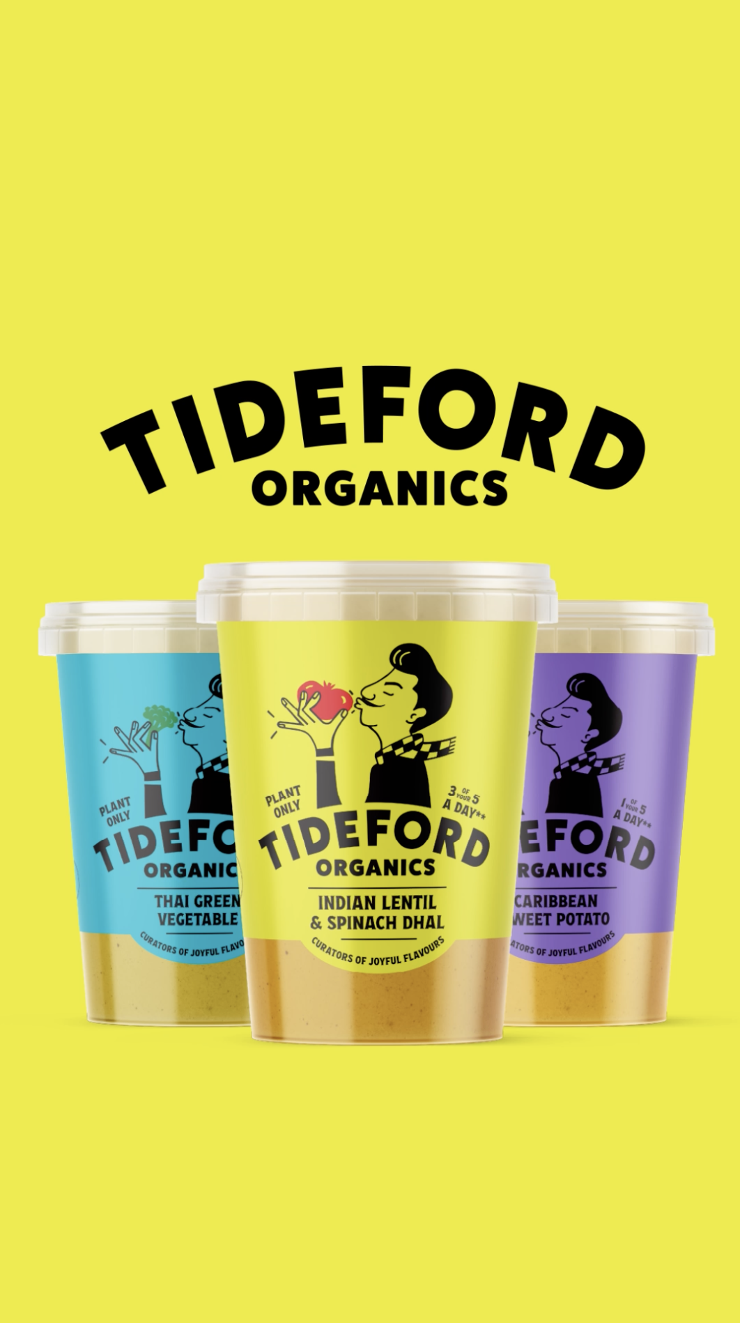
Tideford - FMCG

Unilever - FMCG

Ministry of Defence x G-SHOCK - Electronics

Convatec - Healthcare